An Unofficial Logo Design Experiment
All this digging into 7-Eleven’s graphic identity (BTTF II & Lucky Dragon) has made me want to do my own version of a futuristic 7-Eleven logo.
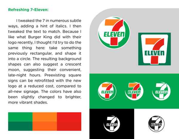
I tweaked the 7 in numerous subtle ways, adding a hint of italics. I then tweaked the text to match. Because I like what Burger King did with their logo recently, I thought I’d try to do the same thing here: take something previously rectangular, and shape it into a circle. The resulting shape can also suggest a crescent moon, implying their late-night hours.